
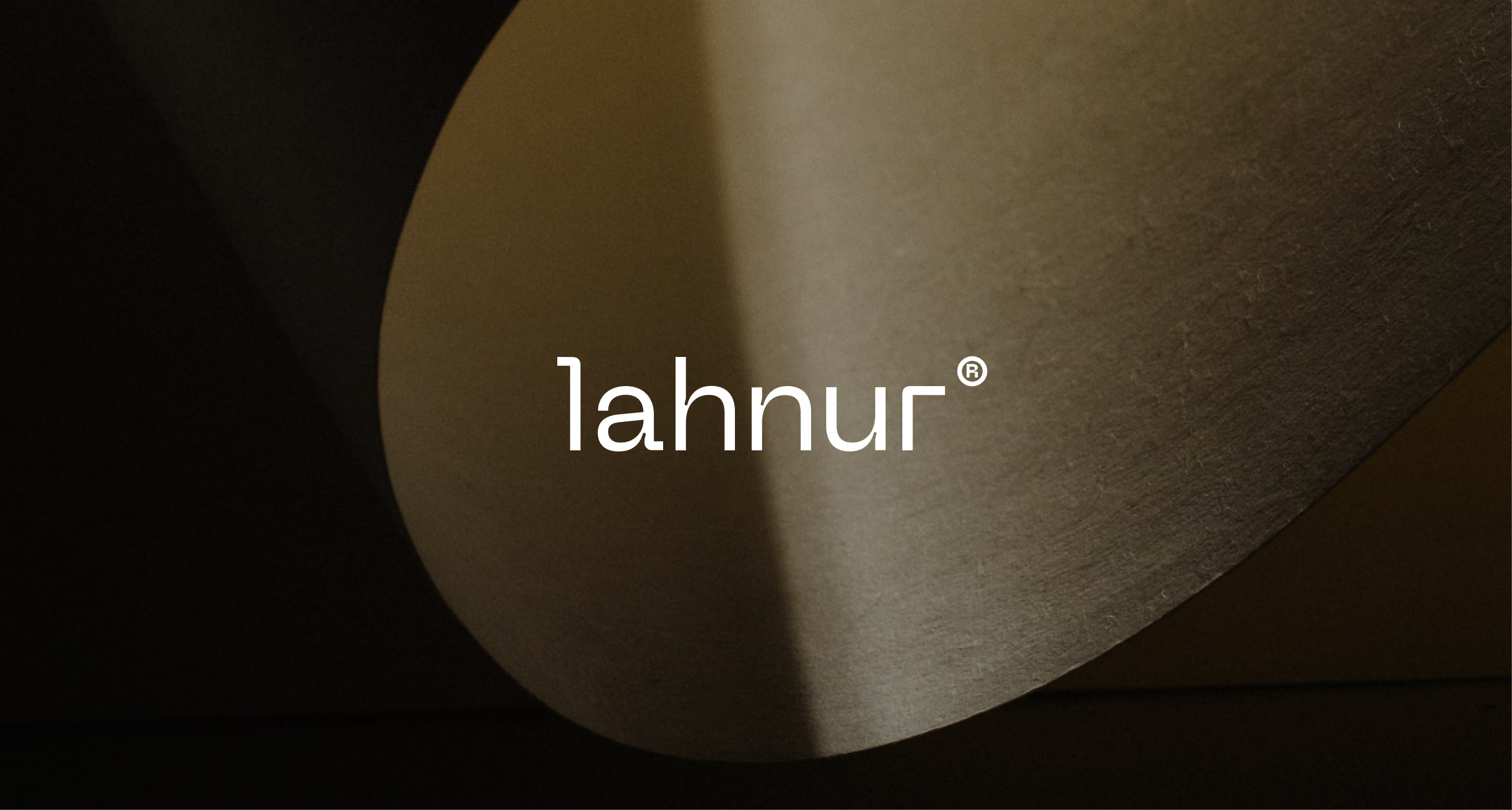
Ein Material, dem eine Stimme verliehen wurde
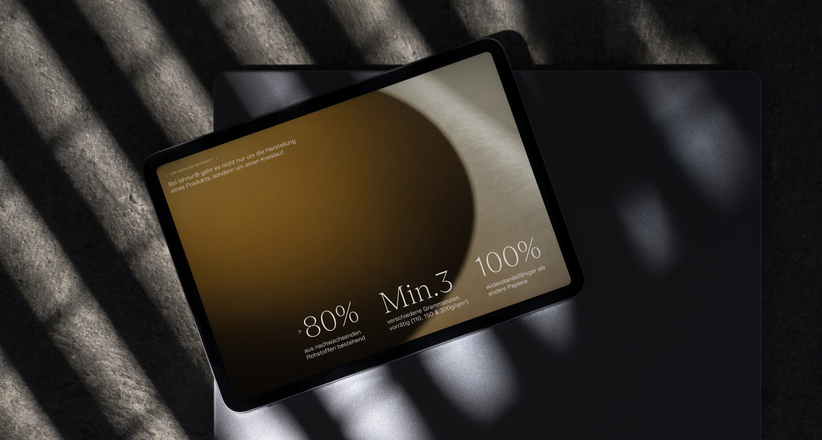
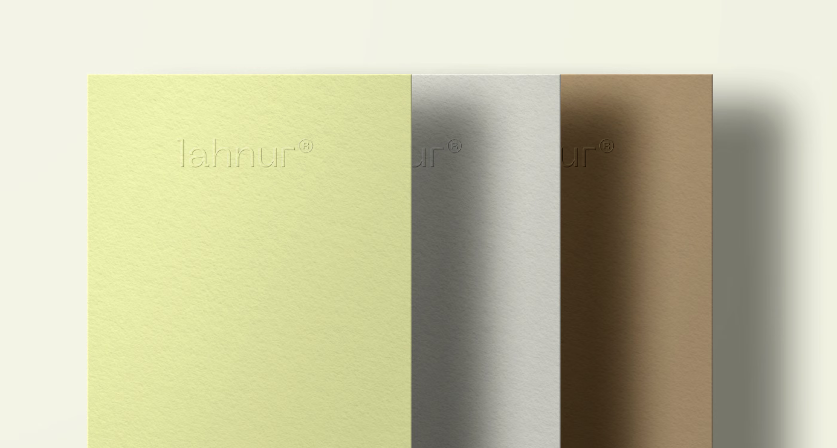
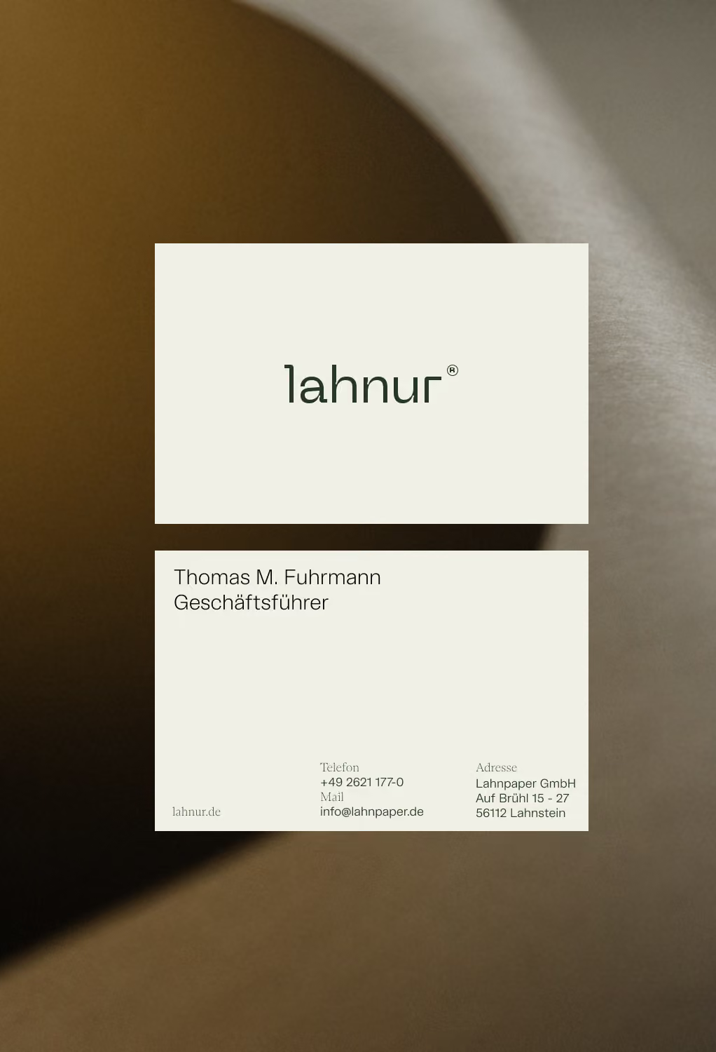
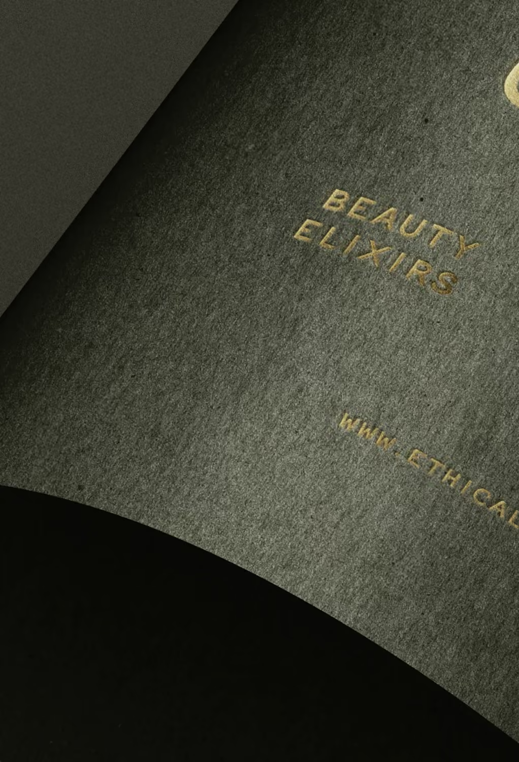
Papier hat ein Wahrnehmungsproblem. Nicht in Gramm, sondern im Kopf. Es steht heute vor allem für eines: Einweg. Lahnpaper wollte das ändern. Auf Basis jahrzehntelanger Expertise in Spezialpapieren entwickelte das Unternehmen lahnur®: ein zertifiziert rezyklierbares Papiersubstrat, reiß- und nassfest, für Lebensmittelkontakt zertifiziert und haptisch feiner als herkömmliches Papier. »lahnur® war Liebe auf den ersten Griff.« Das Produkt war da. Die Marke noch nicht. Gemeinsam mit dem Lahnpaper-Team bauten wir ein vollständiges Markenframework rund um eine Idee, Raffinesse: Brand Narrative, visuelle Identität und eigenständige Value Propositions für zwei grundverschiedene Zielgruppen, Großhandelspartner und Endkonsument:innen.
Die Branche
Nachhaltige Materialien
Die Herausforderung
lahnur® ist zugleich robust und weich, eine Kombination, für die die Branche keine Sprache hatte. Die Marke musste zudem zwei sehr unterschiedliche Zielgruppen zugleich überzeugen: Großhandelspartner, die auf industrielle Skalierbarkeit achten, und Endkund:innen, die nach Ästhetik, Haptik und Nachhaltigkeit entscheiden.
Das Ergebnis
Eine unverwechselbare Marke, die lahnur® eine Sprache gibt, um in beiden Märkten zu bestehen, ohne an Wow-Faktor einzubüßen. Sie gibt Lahnpaper zugleich eine Plattform, um lahnur® über eine einzelne Produktlinie hinaus zu einer vollständigen Materialidentität auszubauen.
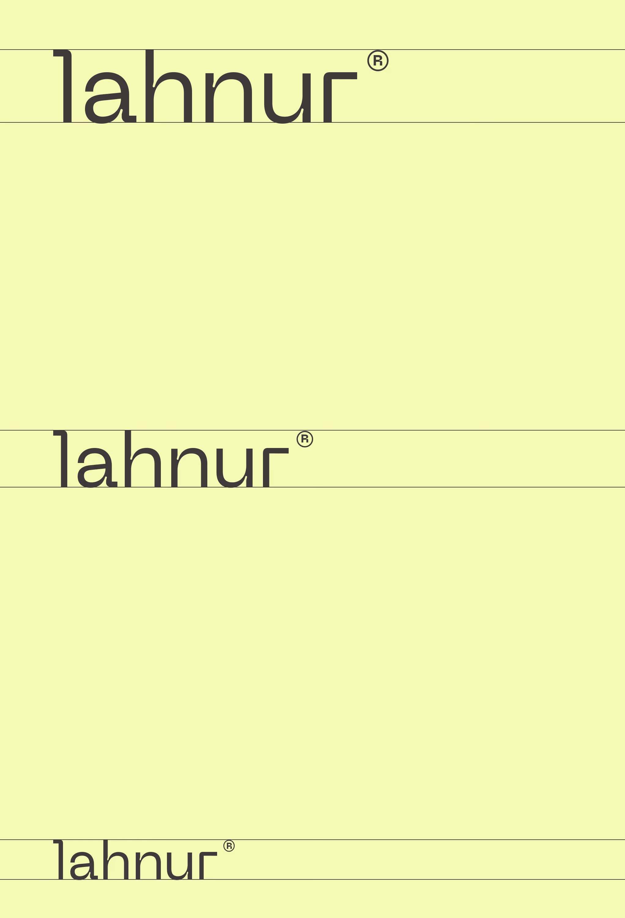

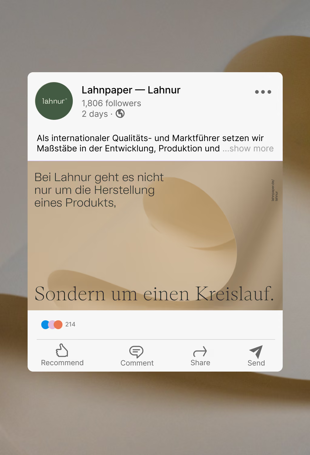

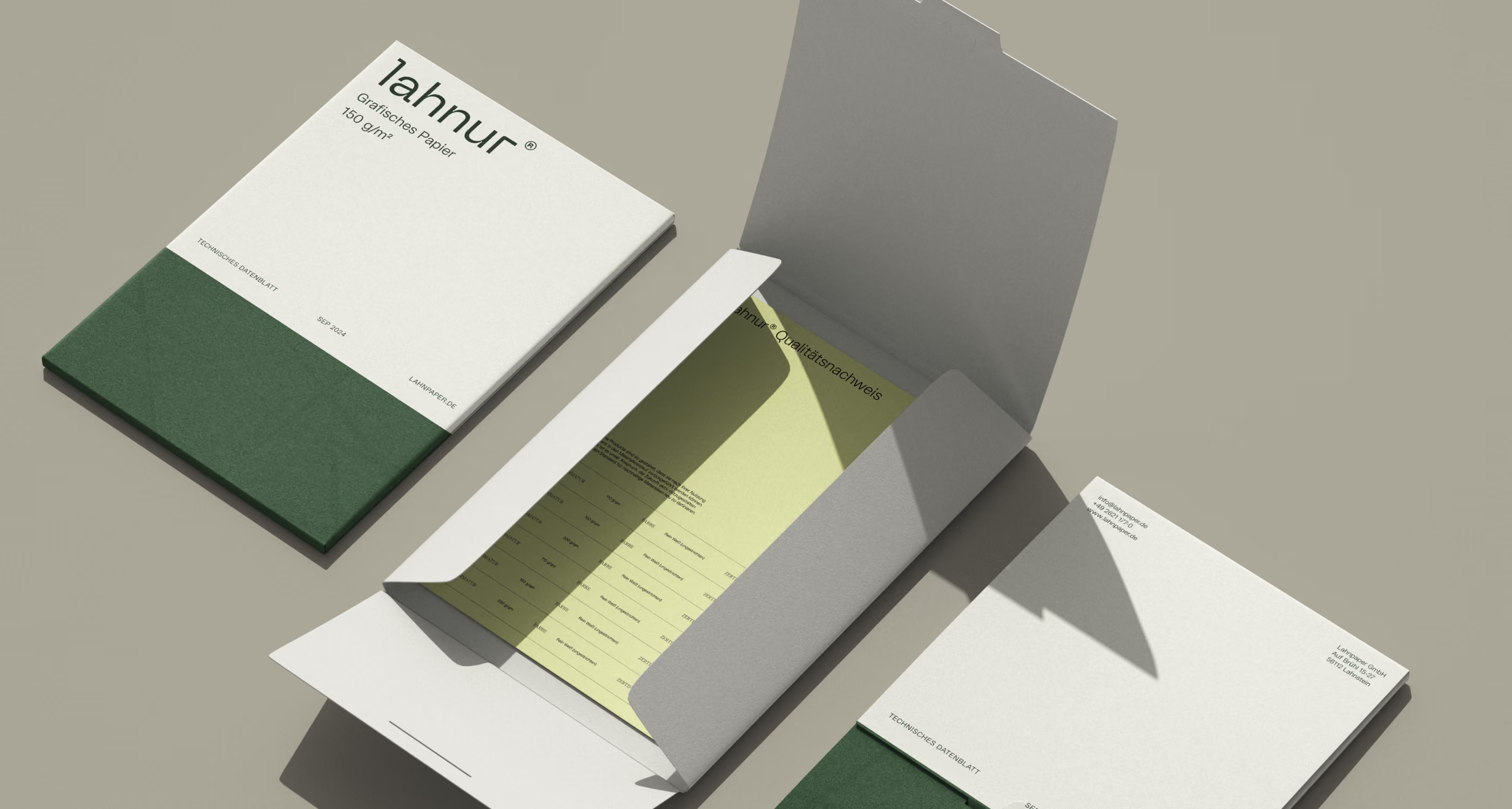
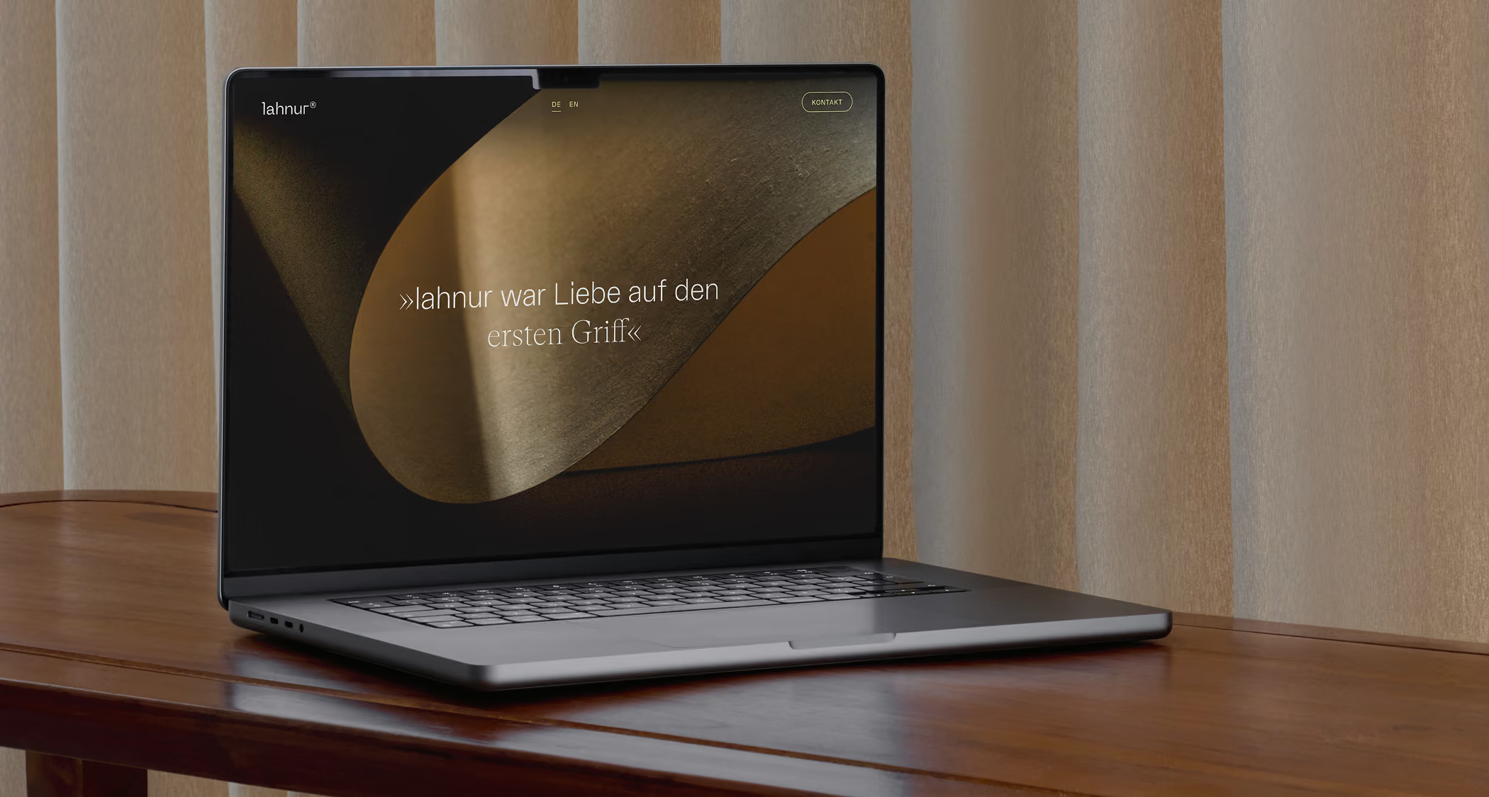
›Rafinesse in jeder Faser.‹ bringt auf den Punkt, was keine technische Spezifikation leisten kann: die gleichzeitige Präzision und Sanftheit, die lahnur als Material — und als Marke — ausmacht. ›Faser‹ arbeitet auf zwei Ebenen. Es meint das Material selbst — das Papiersubstrat, die physische Substanz. Und es spricht von Charakter: der Qualität, die sich durch alles zieht, was lahnur® berührt.

»lahnur® war Liebe auf den ersten Griff.«
Client
Lahnpaper GmbH
Project Team
Laura Hermlin-Leder
Dorothea Baumann
Jan Erlinghagen
Lena Wessel
Nikola John
Mehr Cases
Lust auf weitere Cases?
There you go!
Wie geht es weiter?
Das war erst der Anfang. Gerne stellen wir Euch ein maßgeschneidertes Portfolio zusammen.
Unsere Brand-Agentur wurde 2018 gegründet. Aktuell sind wir ein Team aus 16 Branding-Expert:innen. Insgesamt haben wir bereits über 100 Markenprojekte umgesetzt.
