
A material that finally has a voice
Paper has a weight problem. Not in grams, in perception. It is increasingly synonymous with disposability. Lahnpaper set out to change that. Built on decades of specialty paper expertise, the company developed lahnur®: a certified recyclable substrate that is tear-resistant, moisture-resistant, and haptically finer than conventional paper. «lahnur® was love at first hold.» The product was unrivaled. The brand wasn't there yet. Together with the Lahnpaper team, we built a full brand framework around a single idea, finesse: brand narrative, visual identity, and distinct value propositions for two very different audiences, wholesale partners and end consumers alike.
The Industry
Sustainable Materials
The Challenge
lahnur® is simultaneously robust and soft, a combination the category had no language for. The brand also had to convince two very different audiences at once: wholesale partners weighing industrial scalability, and end consumers choosing on aesthetics, haptic quality, and responsibility.
The Outcome
A distinctive brand that gives lahnur® the language to operate in both markets without flattening what makes it different. It also gives Lahnpaper a platform to grow lahnur® beyond a single product line into a full material identity, ready for new applications and new markets..
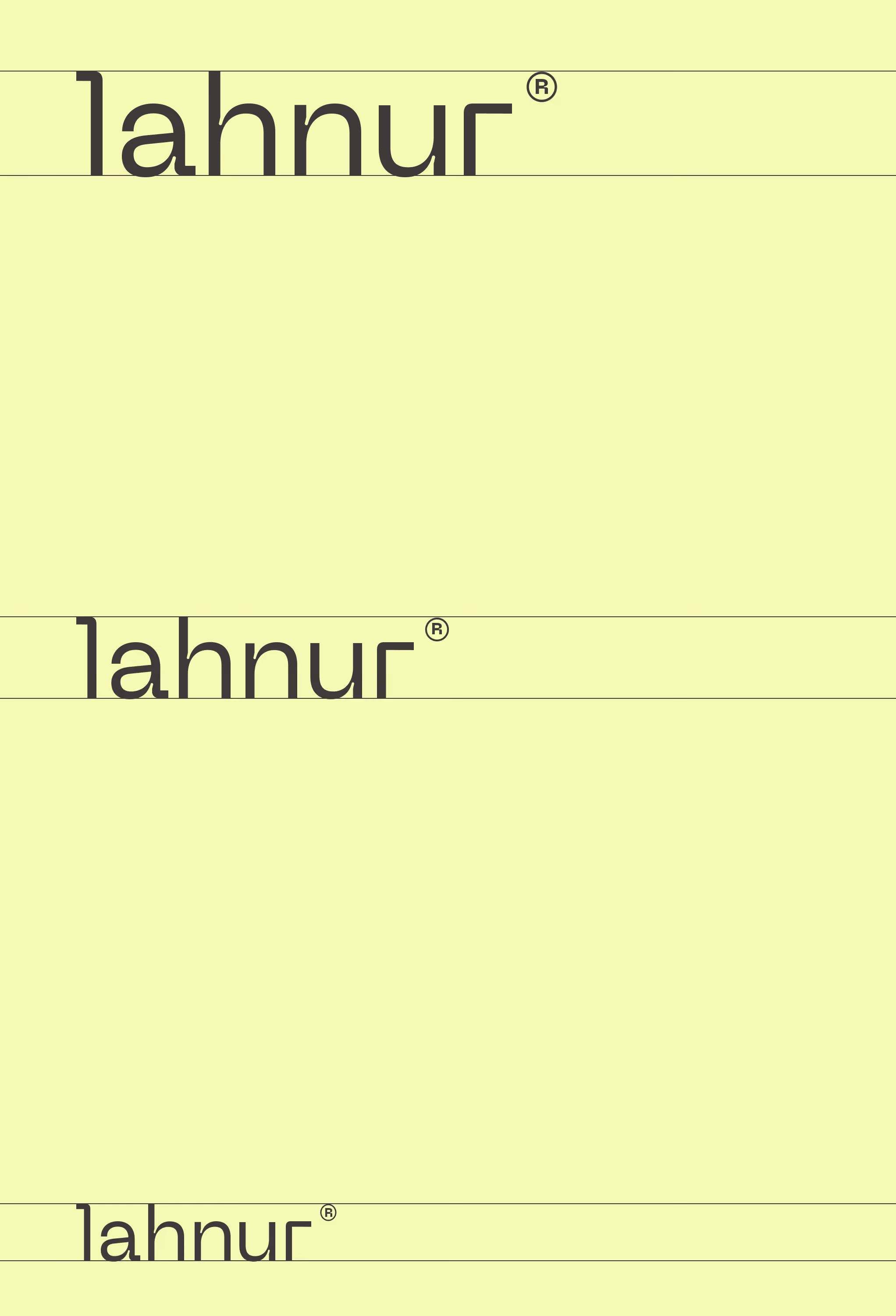

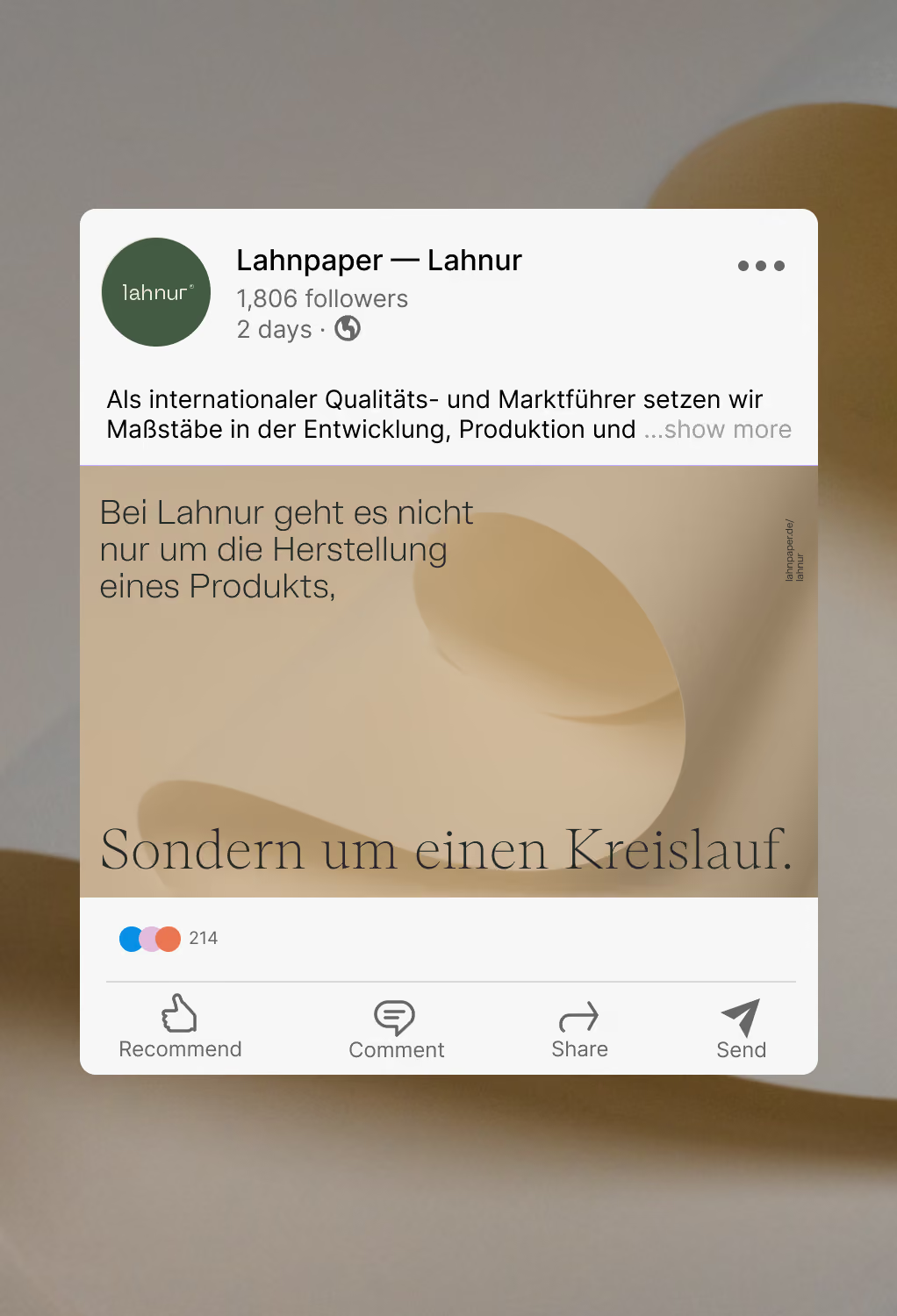

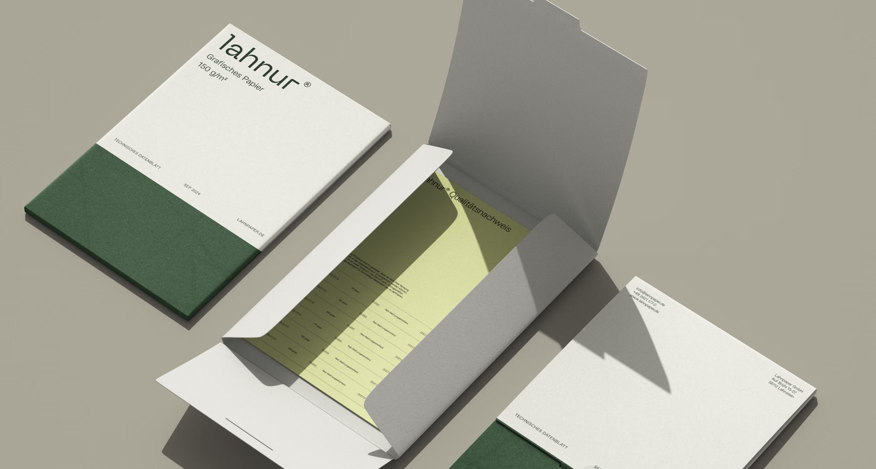
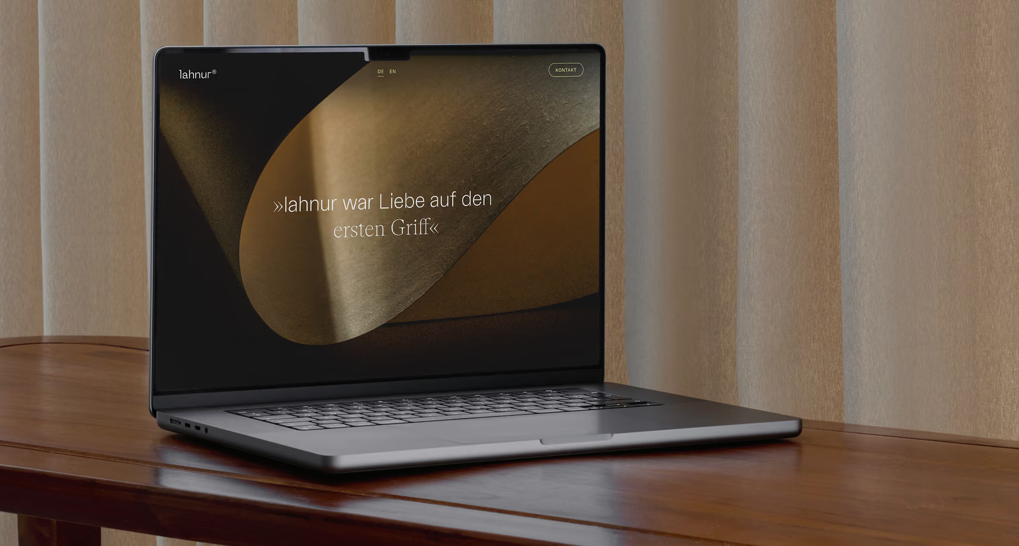
‹Finesse in every Fiber› captures what no technical specification could: the simultaneous precision and softness that defines lahnur® as a material—and as a brand. ‹Fiber› operates on two levels at once. It refers to the material itself—the paper substrate, the physical substance. And it speaks to character: the quality that runs through everything lahnur® touches.
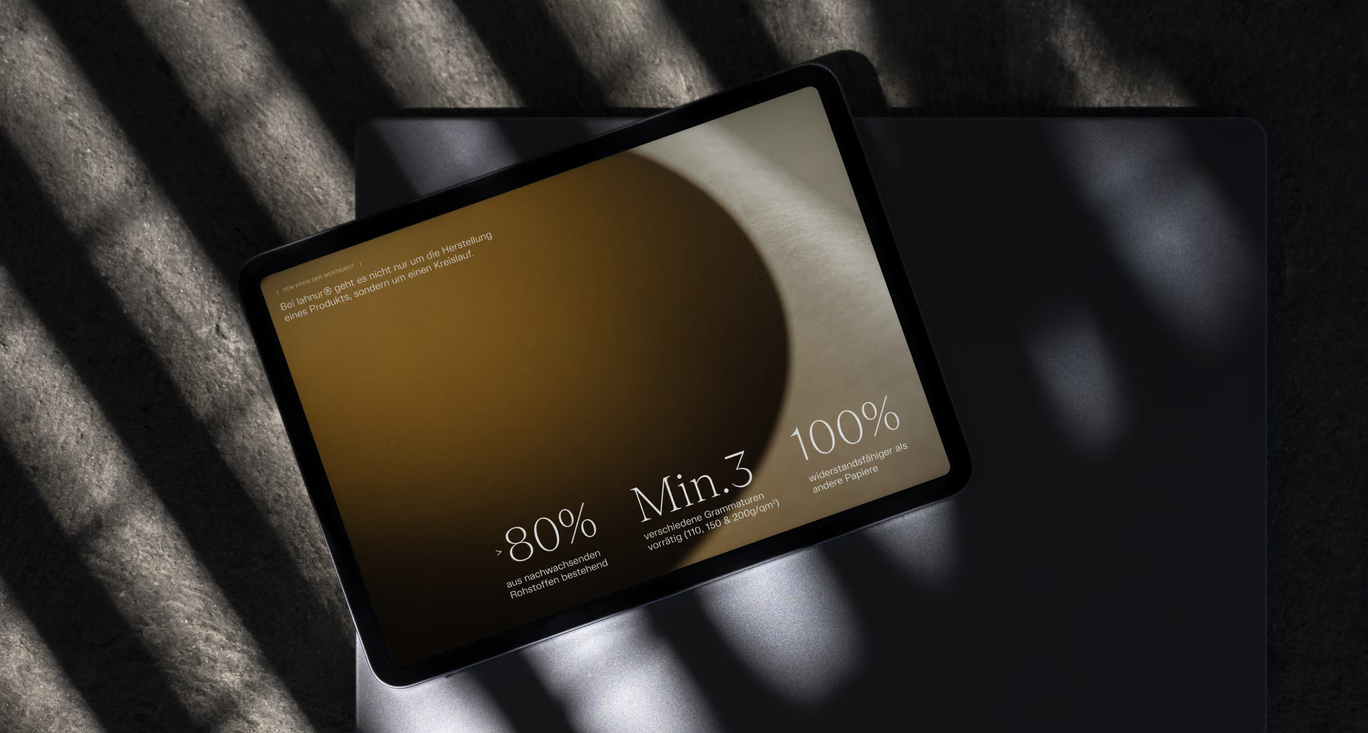
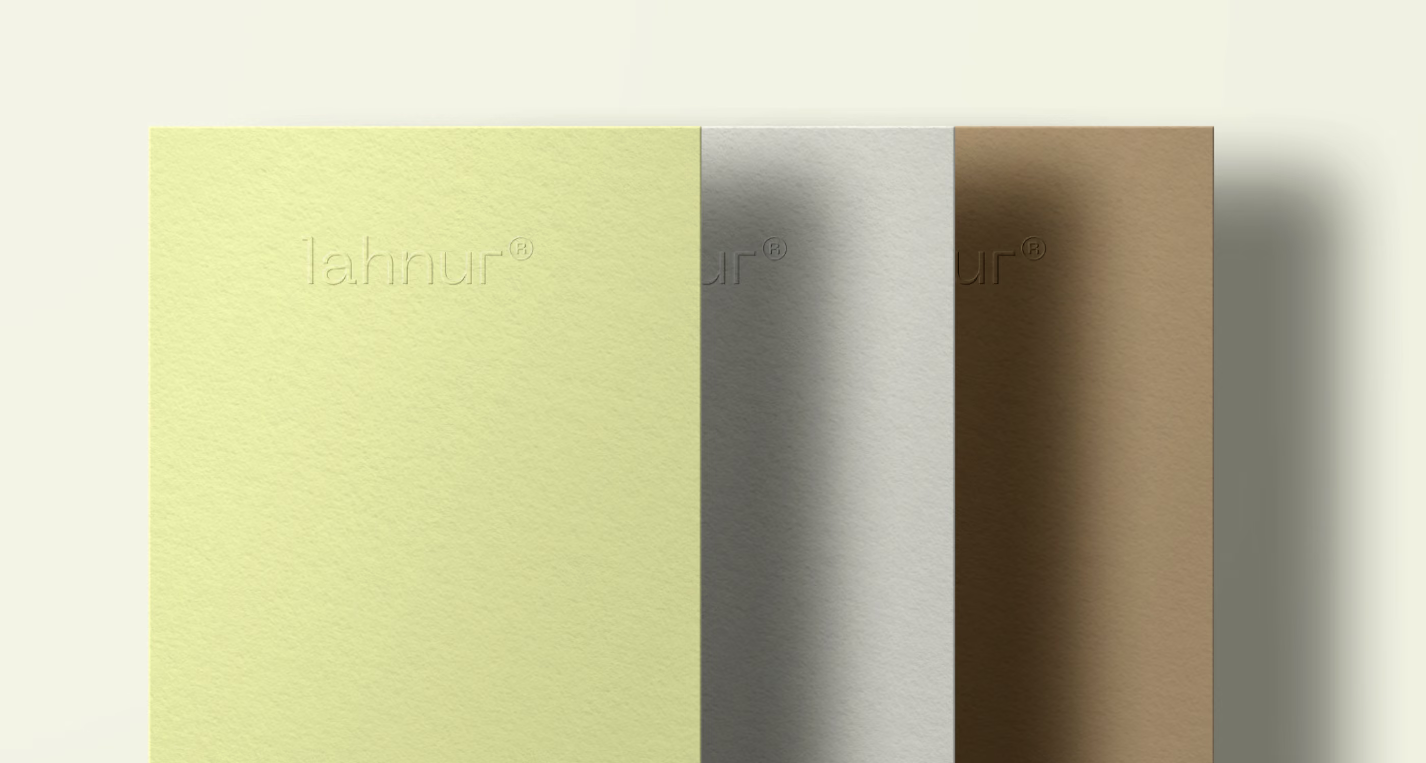
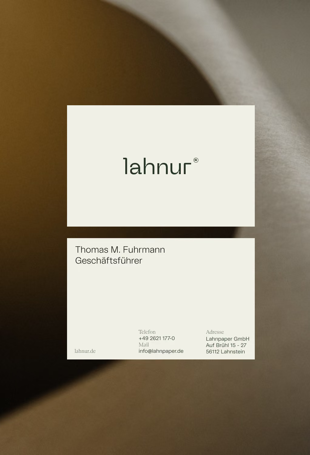
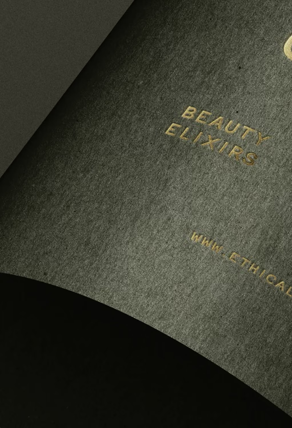

«lahnur® was love at first hold.»
Client
Lahnpaper GmbH
Project Team
Laura Hermlin-Leder
Dorothea Baumann
Jan Erlinghagen
Lena Wessel
Nikola John
More Cases
You want to discover more Cases?
There you go!
How do we move on?
There’s more where this came from. We’d love to assemble a costom case portfolio just for you...
Our brand agency was founded in 2018. Currently we are a team of 16 branding experts. In total we have run over 100 brand projects already.
